BP: Blatant Parody
April 7, 2014 — By Dr. PeteIt's easy to poke fun at someone else's minimalist rebrand gone wrong, so I thought it would be a good time to go after a brand that hasn't made the leap yet. Today's subject is BP (formerly known as British Petroleum, but we'll get to that):
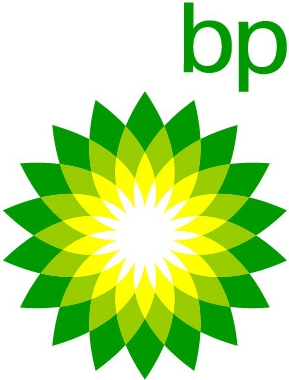
The problem here is obvious – do you know how long it takes BP's team of designers to draw this over and over, even with a decent Spirograph? That's not to mention the fact that they're always running out of Solar-Sucks Yellow and Deforestation Green crayons. You can only get those in the 64-pack, so they're constantly having to throw out all the other colors. If there's one thing BP is against, it's pollution, so this just won't do.
What Is A BP?
Let's start with what BP isn't – it's not in any way British or connected to petroleum. Much as KFC changed its name to remind us that they're not from Kentucky, don't fry anything, and their product is in no way made from actual chicken, BP wants it to be clear that they are emphatically neither from England nor involved with oil.
BP's logo reminds us that they love the earth and the sun and really just anything green is super-great. Their logo is known as the Helios, named after the Greek god of inhaling balloons and talking like Alvin and The Chipmunks.
Fire The Minimalizer!
So, let's strip it down – they're BP and they're green:
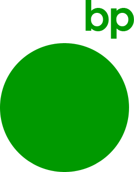
Ok, no one's going to cut me a check for that design. Plus, why is "bp" always floating out in space? Sure, when the earth is no longer habitable, the'll have to move their corporate headquarters to a space station, but let's not remind people of that. Let's keep it terrestrial:
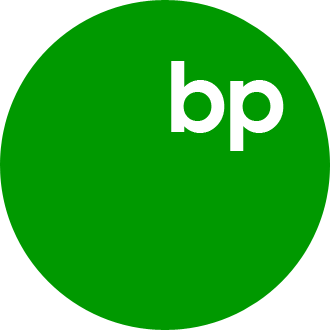
Can you spot the problem (no, not "It sucks!" – no, you shut up!)? Looking at the globe as a Western-hemispherer, what do we associate with the upper-right corner? That's right, Great Britain (note: map is not to scale, nor to sanity):

If we've learned one thing today, it's that BP is totally not British. Let's avoid any geopolitical favoritism and just get back to basics:

BP: Boring, Pete!
Yeah, maybe that's a little too basic. It needs a little pizzazz. How about a tree?

I'm torn... on the one hand, maybe this is carrying the whole green thing too far. On the other hand, I can't help but think my tree looks a bit too much like this:

I'm gonna go out on a limb (no pun intended) and say that nuclear annihilation is probably not a positive brand image.
PB: Prehistoric, Baby!
Maybe BP has just taken their self-denial too far. You know what’s cool about oil? It's made from dinosaurs. It's time to go prehistoric on your own asses, BP:

You may be thinking: "Is that actually minimalist?" to which I would have to retort "STEGOSAURUS!" I think you can see that you're on the wrong side of this argument.
Let's try it with a bit more minimalism. You know what those stegosaurus spikes remind me of – the Helios design of BP's current logo. It's time to cross the streams, Egon...
When I saw this version, my first instinct was to give it a tail and racing stripes. Trusting my instincts has almost never left me bleeding and unconscious on the floor of a cock-fighting arena in Tijuana, so let's go with that:
Mesozoic Minimalism – You're welcome, un-British anything-but-Petroleum.