5 Painless Usability Fixes
February 12, 2008 — By Dr. PeteOne of the worst parts about being a usability consultant is being brought in on the tail-end of a project and realizing that it needs a major overhaul. Even for something as relatively easy to re-engineer as a website, a major redesign (especially for a large company) can take months and cost tens of thousands of dollars.
Fortunately, in this age of CSS-driven design, not all changes require starting from scratch. So, in the spirit of saving you money and aggravation, here are 5 usability fixes that are relatively painless but can have a big impact:
1. Increase Text Contrast
Even in 2008, readability is a big problem on many websites, and one of the major culprits is still text-to-background contrast. I know black text on white feels boring to some people, but there's a good reason it's so common. Compare the examples below:
Of course, a little artistic license is ok, but unless cutting-edge design is a big part of your brand (you're an artist, for example), stick to high-contrast text.
2. Increase Font Size
Similarly, we all have a bad habit of wanting to stuff as much text as possible on the screen, and that often means using tiny fonts. Even if your audience is young and has 20/20 vision, small text takes longer to read and is more likely to be ignored. At the same time, many of us are using road-warrior laptops, PDAs, and other devices with small screens to browse the internet.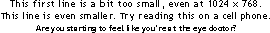
3. Increase Font Spacing
Nature may abhor a vacuum, but good designers appreciate the value of whitespace. Empty space helps us separate words and objects, and the more crammed together information is, the harder it is for people to process quickly.
4. Reduce Home-page Copy
If a decade of digging through web analytics and studying test results has taught me anything, it's that people don't read. It's easy, especially in a corporate culture with competing interests (management, sales, legal, etc.) to overload your home-page, but the more information you put out there, the more cluttered your message becomes.Of course, redesigning the home-page and redeveloping the "real estate" is a big job, but one easy place to start is with your marketing copy. See if you can say the same thing with half as many words (or even a third).
5. Make Links Look Clickable
Somewhere around 2000, we started to get bored with blue, underlined links and decided it was time to mix things up. From a design-perspective, it's understandable to want variety, but people still expect links to look a certain way, and the farther we stray, the less they understand what's clickable.
If you're not using traditional links, at least consider making those links either the traditional blue or underlined and in a different color than surrounding text. Stay clear of using other types of emphasis, like bold text, to indicate links.
Home | Who is Dr. Pete? | Are You A Real Doctor? | Can I Hire You? | Archive
©2026 User Effect, LLC.